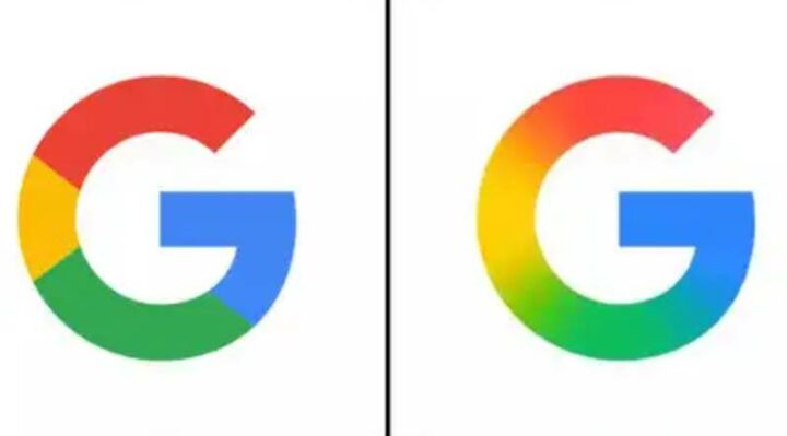
Google has quietly introduced a subtle yet significant update to its iconic “G” logo, giving it a modern gradient twist. The new design, which was first spotted on iOS and Pixel phones, replaces the traditional sharp color borders with a smooth blend of red, yellow, green, and blue — the tech giant’s signature color palette.
First Redesign Since 2015
This marks Google’s first major “G” logo update since 2015, when it shifted to a sans-serif typeface and introduced the colorful single-letter logo as part of a broader brand refresh. While that redesign was bold and easily noticeable, the 2025 update is more refined, reflecting design cues from Google’s more recent Gemini logo, which also features a soft gradient aesthetic.
Gradient Aligns with Google’s Evolving Visual Identity
The new gradient look aligns with Google’s modern design language, emphasizing fluidity, minimalism, and harmony. This change helps create a more unified brand appearance across its expanding ecosystem, especially as AI-driven products like Gemini continue to play a central role.
Limited Rollout for Now
As of now, the updated “G” logo is only visible within the Google app on iOS and Pixel devices. Other Android platforms and web versions still show the older version with distinct color divisions. There’s no official word yet from Google regarding a full rollout or broader branding changes.
While this may seem like a small shift, it’s a reminder that even subtle design updates can signal larger branding intentions. Keep an eye out for this sleek new “G” as it gradually makes its way across Google’s platforms.


